Hattie’s Barometer of influence – Infographic

Throughout his Visible Learning journey John Hattie has used the “barometer” to visualize the effect size of an influence on student achievement. It has also also been on the cover of several Visible Learning books. The barometer scale is divided by the hinge point d = 0.4, which represents according to Hattie the mean of all effect sizes in the underlying meta-studies. Hatties “barometer of influence” goes from red (negative effects), to yellow (developmental effects), to green (teacher effects) and finally over the hinge point 0.4 to the blue zone (desired effects).

Visible Learning Barometer of Influences
Visible Learning Barometer of Influences. (c) 2019 Corwin and Osiris

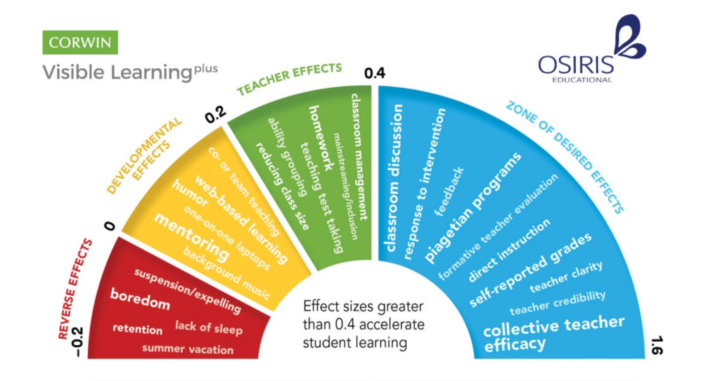
The team of Corwin Visible Learning Plus and Osiris Educational have made a nice Infographic available, that is based on this visualization technique and draws data from 250+ influences. You can download and print the PDF at the Osiris Educational Blog.

Source:

Posted in Infographic, Infographics

Leave a Reply

Your email address will not be published. Required fields are marked *

*

CAPTCHA Code *

Online-Feedback

Edkimo Online-feedback. Try it now, it's free!

About Visible Learning
Visible Learning means an enhanced role for teachers as they become evaluators of their own teaching. Visible Teaching and Learning occurs when teachers see learning through the eyes of students and help them become their own teachers.
Weblinks


Visible Learning plus is a professional development programme for teachers. It provides an in-depth review and change model for schools based on John Hattie's research. With a seminar and support series the Visible Learning plus team helps schools to find out about the impact they are having on student achievement. www.visiblelearningplus.com